How to Read a Graphic Novel or Comic Strip: Part 1
By The Edge Learning Center
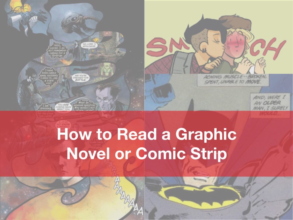
If you are taking IB English, you may have noticed that comic strips sometimes show up on the Paper 1 exams (e.g. November 2015 for Language and Literature SL) and graphic novels are sometimes assigned to us for Paper 2 (e.g. Persepolis and Maus). The purpose of this blog is to provide novice readers with a basic understanding of how to approach a page from a graphic novel and to give more experienced readers of comics a greater appreciation of the various features of the medium.
To begin with, let’s cover some basic terminology.
Panels are the frames that contain text and images to tell part of the story, and Gutters are the spaces in between those panels. Take a look below to see how these are used.
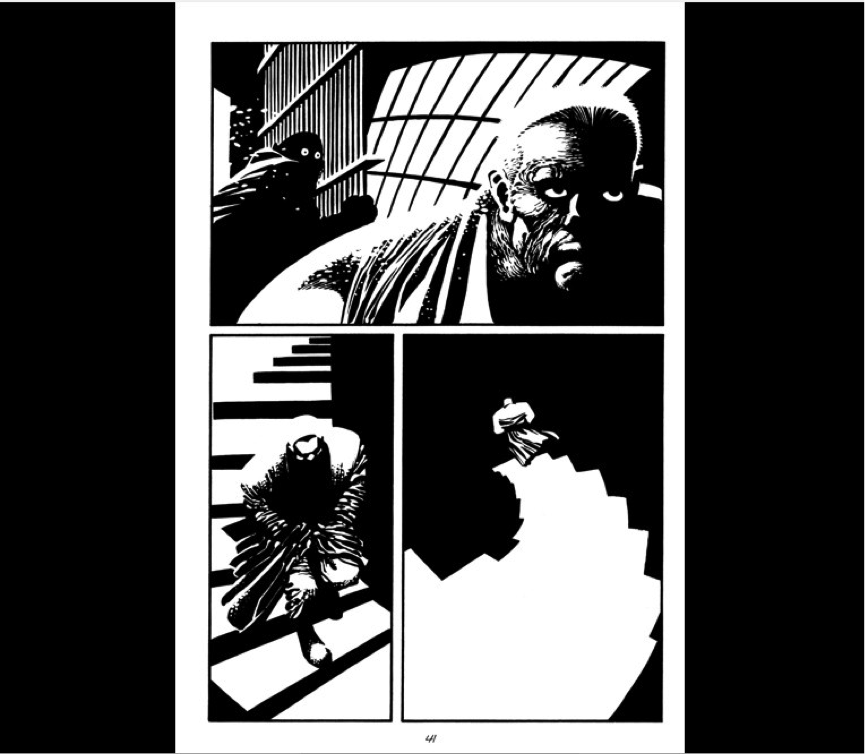
In Frank Miller’s Sin City short story “Silent Night,” we see a simple sequence of images pieced together to show the protagonist Marv descending a staircase for an as-yet-unknown purpose. The term icon is used to refer to the representation of identifiable objects in a frame. Marv, the frightened porter, and the staircase are all icons. The extremes of light and shadow create a particularly menacing tone, and contribute to an overall sense of graphic weight, that is, contrast within the image. One effect of this graphic weight is that it highlights the emotional contrast between the characters in the first panel, just by showing us the characters’ eyes. Another effect is in the last panel, where Marv comes to the end of the staircase, and will step off into the unknown. It looks almost as if he will fall from this last step, into an infinite abyss. So much tension in a single page!
Bleed is a term used to describe an image that runs over to the edge of the page. It is not contained within a frame, that is, the outline of a panel.
When a page bleeds on all sides of a page, it is called a full bleed or splash, which we’ll see in the next picture.
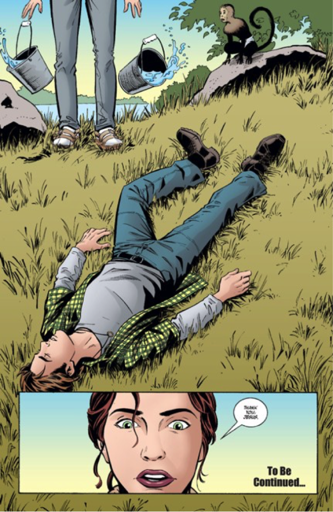
This is taken from Y: The Last Man, a comic about a plague that wipes out all of the male animals on earth except one man and his pet monkey. Throughout this issue, each page contains a large white gutter on all sides. But when the last man is discovered on the final page, the frame opens wide! The splash is often used for big reveals and cliffhangers, and I would like to think that it creates a sensation much like opening your eyes wide to take in a moment that stuns or overwhelms us. The bottom panel focuses in on the woman, whose eyes are likewise wide, allowing us to share her shock.
Words are communicated via captions, thought bubbles, and speech balloons. Captions usually come from a voice outside of the picture’s time frame. This can be from a narrator, or it may come from a character reflecting on the action of the comic some time after it has occurred. It has an effect similar to “voice-over” in movies. However, in the following panel, the captions provide something more akin to commentary.

Above, we see Batman in The Dark Knight Returns. Batman provides narration for his first experience returning to crime fighting after a long layoff. These words express Batman’s thoughts as he returns to fighting bad guys (hence, “This” in the first caption). Captions can provide insight into thoughts and feelings in ways images alone cannot.
Thought bubbles convey a character’s thoughts. Simple enough. Check out the next panel from an older Batman comic.

Okay, so the first thing we notice is that Batman and Dick sleep in the same room, Yes, this is really creepy, and no, this is not rare in Batman comics from years back. This is just one instance of numerous homoerotic undertones from the earlier days of Batman. So, when we are ready to get over the fact that our beloved Batman is pining for a ten-year-old Dick, we should notice that the thought bubble conveys Batman’s thoughts at the moment they occur. This is similar to when an omniscient narrator conveys the thoughts of a character to the audience in fiction. Now, you may have noticed that it’s rather difficult to differentiate between the functions of the thought bubble in the above image, and the captions in the image before. I like to think of the difference as similar to that between direct speech and free indirect discourse. In the image above, we know for certain that the words in the bubble are Batman’s at precisely this precise moment. However, in the first image of Batman from The Dark Knight Returns, we don’t have the trail of bubbles to make the connection between the words and Batman. The reader is then forced to infer that the speech comes from Batman, but that it has the effect of being mediated by a narrator or author.
Speech balloons tend to make up the majority of the written text in comics and graphic novels, and the balloons themselves can be written in a variety of ways to demonstrate the qualities of a particular voice.
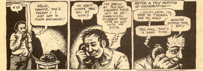
Here, protagonist of American Splendor protagonist Harvey Pekar is talking with an old friend. Notice that the speech balloon for the friend has jagged lines like bolts of electricity leading to phone receiver, suggesting that the voice is slightly altered by the phone transmission. Below is another creative use of speech balloons.
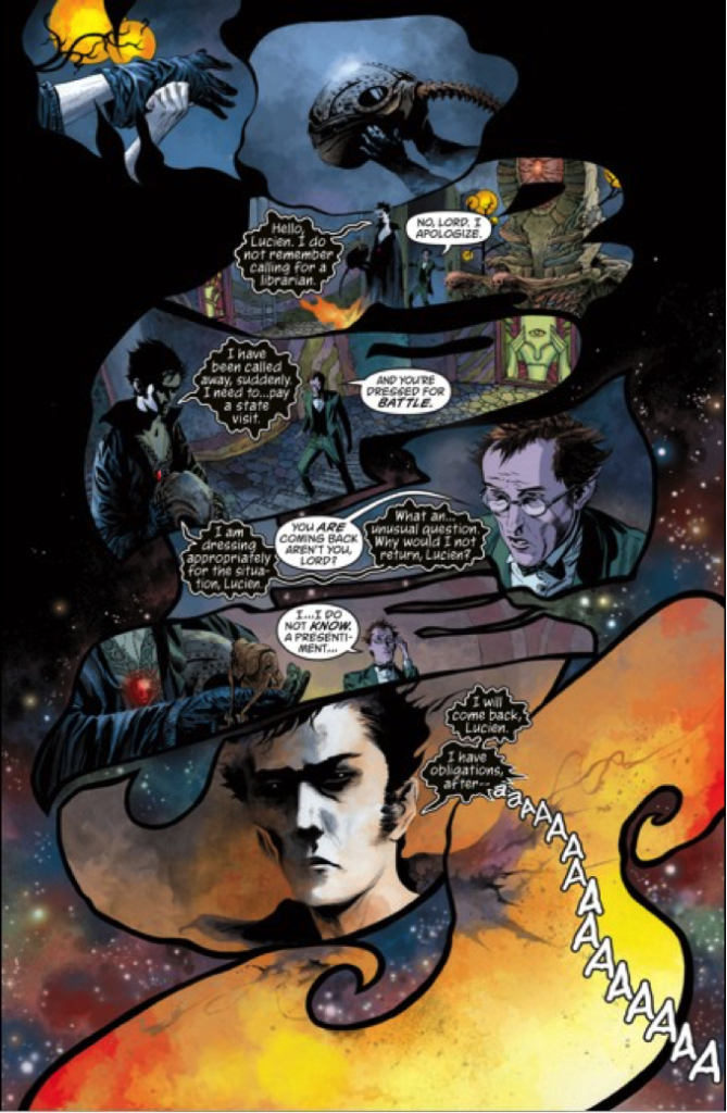
Above, the aptly named Morpheus of Neil Gaiman’s The Sandman has speech balloons that seem amorphous and even animated, like gooey puddles or smoke. That they are black with white lettering lends them additional spookiness, and the reader is provided the challenge of imagining what kind of voice could match these balloons, which don’t even look like balloons anymore. The reader becomes an active participant in the text, providing the most ethereal voice he or she can conjure.
The last use of text is probably the most inherently comic.
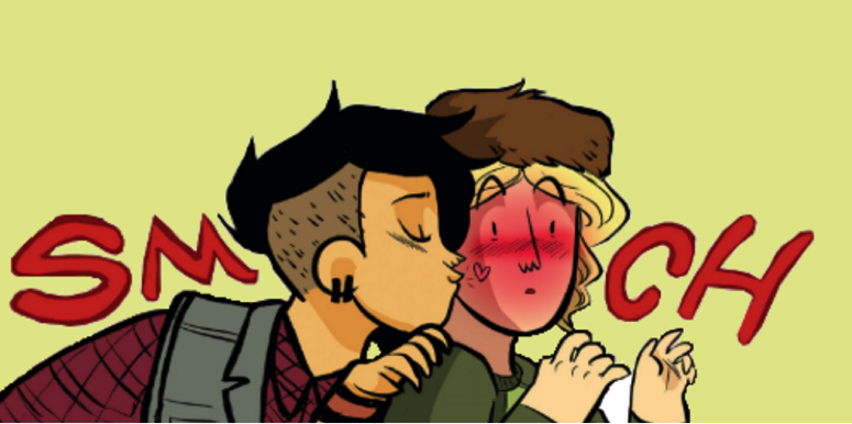
In this example from Lumberjanes, Shannon Watters, Grace Ellis, Brooke A. Allen, and Noelle Stevenson make clever use of the characters’ heads to spell “smooch”. Here, the two characters create the smooch in more ways than one: by being part of the action, and part of the word itself. Notice too that this, along with the heart on the blond girl’s cheek, her rouged face, and the overall cartoonish art contribute to a playful tone in this comic.
Before I wrap up, I’d like to take a look at how several of these elements come together to create a scene. When looking at the scene below from an issue of 100 Bullets, remember that we read graphic novels from left to right, and top to bottom (unlike Manga!).
Okay, so here we have a familiar scene where two tough guys sit across from each other at a diner, and one points a gun at the other but keeps it discreetly under the table. What makes this sequence unique is not what happens, but how it is conveyed to us. Notice that unlike a movie, the graphic novel medium allows us to see the entire scene unrestricted by sequentiality. While we know we’re supposed to read it in that zigzagging pattern I mentioned before, we can’t help but see it in its entirety, as a single, (in this case) mostly symmetrical image. All sense of time is removed from the scene, and it exists laid out in front of us as not a chronology, but as a geometric pattern. This is the only medium known to me that allows us to see existence with true omniscience, unrestricted by time. Even an experienced reader of graphic novels will glance at the page in this way and grasp, however briefly, an entire scene at once.
When we “read” the page, we can view the top half of the page as a single image: one in which two men are sitting; one drinks coffee while the other holds him at gunpoint. But the sequence of panels (left to right) would have us focus on the nefarious man in red first. We are meant to focus on him as the dominant icon in that panel, as he takes up the foreground (the front of the image, as opposed to the background, or the back of the image). Then, in the next panel, we are to focus on the face of the longhaired thug, as he also dominates the foreground of the upper right panel. According to strict sequentiality, we aren’t supposed to know he has a gun under the table just yet, but we can’t help but have seen it already. One might argue that this approach ruins the suspense, and that might be true in this case, but I would argue that it does so to provide the reader with detached omnipotence much like in the art style of cubism. This technique allows the artist to break a moment into pieces and arrange some of those pieces so that a narrative may still be discerned, but also so that the arrangement constructs a perspective unlike anything people can ever see outside of visual art, and almost never in the film.
Next time we’ll be looking at angles of shots within panels, and a number of other things that will help us expand our understanding and increase our appreciation of graphic novels.
About The Edge
The Edge Learning Center is Hong Kong’s premier Test Preparation, Academic Tutoring, and Admissions Consulting services provider. Founded in 2008, The Edge has helped thousands of students improve their ACT and SAT scores as well as their IB and AP grades. Check out our latest Admissions Results!

